Art for red, burgundy and pink walls
Warm walls glow in lamplight and hold strong colour well. Burgundy wants contrast; dusky pink is easier than it looks and takes greens and earthy tones.
Upload your roomBurgundy
#5A1F2B
Dusky pink
#B88A7A
Terracotta
#B5654A
Colours that sit well on red, burgundy and pink walls
Cream
Olive
Ink blue
Ochre
Sage
Gold and dark wood suit burgundy; natural wood and brass suit pink and terracotta. A white mount sharpens the art on any of them.
Contrast on burgundy, greens on pink
On a deep red wall, art with a pale ground, cream or ochre, stands out the way books and brass do in a library. Navy and olive also hold their own. Dusky pink and terracotta are warm and soft, and green is their natural partner: sage, olive, a botanical study.
Frames
Gold, brass and dark wood suit burgundy. Natural wood and brass keep pink and terracotta warm; black gives a crisper, more modern edge.
A real example
We measured the wall from the photo, then made eight pieces from the room's colours. These are the ones the curator chose, with its reason under each.


Layered washes like weather moving over water
Colour Field, thin paint on raw linen style
Sage and ochre answer your plum wall

Arch nested inside a larger arch
Warm Abstract, cut-paper collage style
Echoes the wall in a calmer, lighter way

Misty fields at dawn
Painterly Landscape, soft pastel style
Soft landscape to rest beside the bookshelf

Loose grid of lines with one filled square
Warm Abstract, gouache style
Black lines echo the chair and shelves


Pressed leaves laid out in a loose grid
Botanical & Floral, watercolour and ink style
Earthy browns suit your period room

Three softly curved vertical stripes
Warm Abstract, risograph style
Rust tones echo your velvet and floor

Chalk downland at dusk
Painterly Landscape, woodblock style
Cool blue answers the rose wall

One glowing rectangle floating in a deeper field
Colour Field, soft pastel style
Glowing light suits your sunlit room
Styles that tend to suit
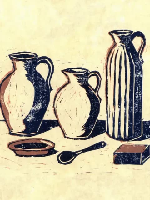
Kitchen & Table
Simple and solid
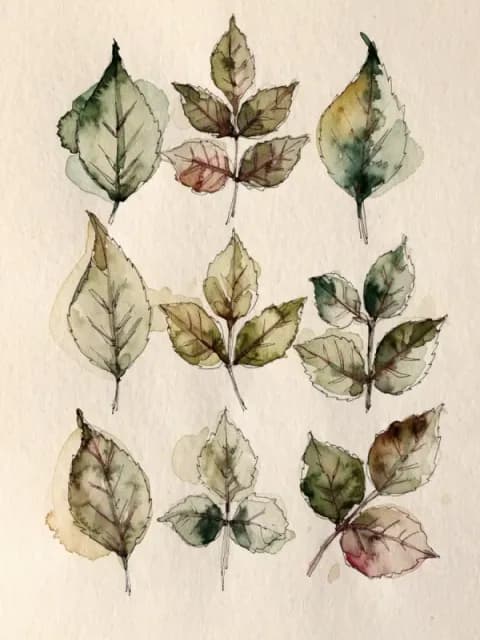
Botanical & Floral
Something growing
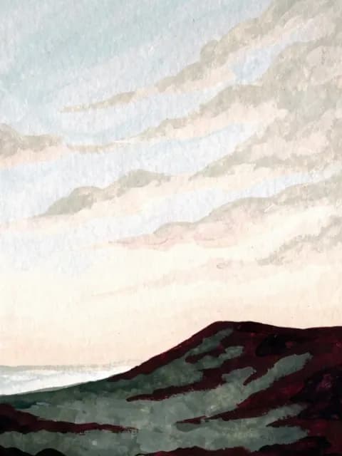
Painterly Landscape
A view to step into
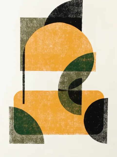
Mid-century & Deco
Shapes with intention
Questions
What art goes with a burgundy wall?
Art with a pale or warm ground, such as cream or ochre, or deep navy and olive for a richer look.
What colour art suits a pink wall?
Greens such as sage and olive, earthy terracotta and ochre, or ink blue for contrast.
Other wall colours
See it on your wall
Your wall is not exactly any of these. Send a photo and we measure its real colour, then make four pieces for it.